If you ever wondered how to create heat maps in excel, here are two simple solutions.
Data preparation
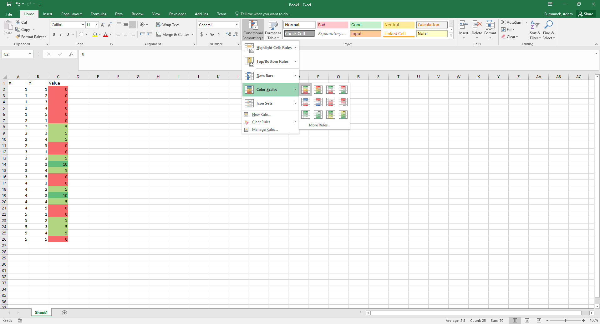
Create two columns with data, as presented below. Next, select values in column C and choose conditional formatting in Home ribbon (see screenshot). This way you can assign colors to values. You can choose More Rules… to customize the colors.
Scatter plot to heat map
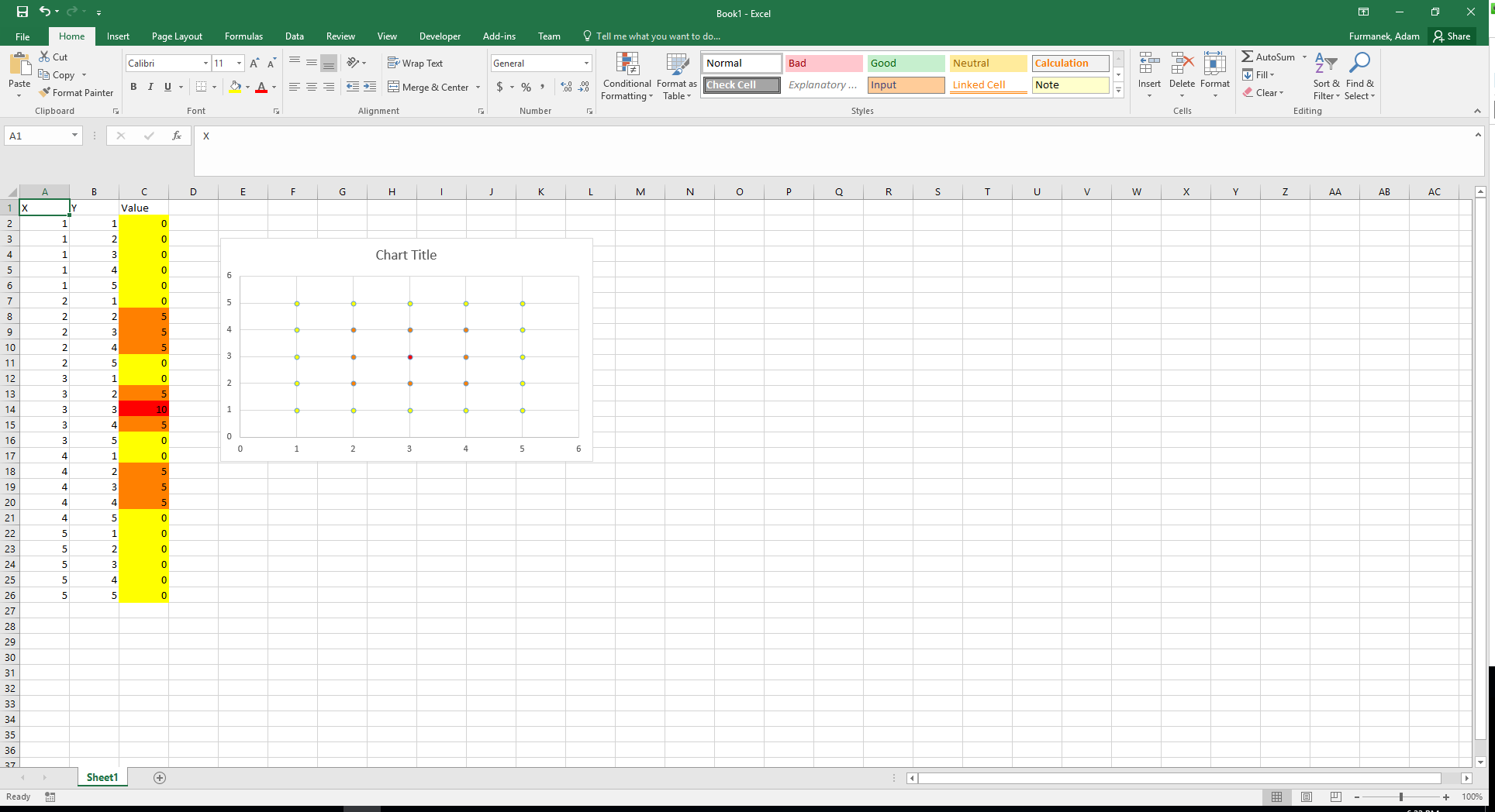
First, create ordinary scatter plot using columns A and B (with values X and Y). Next, use the macro posted here by Reddit user carry_a_laser:
|
1 2 3 4 5 6 7 8 9 10 11 12 13 14 15 16 17 18 19 |
Sub ColorCode() Dim i As Integer Dim MyCount As Integer MyCount = ActiveChart.SeriesCollection(1).Points.Count * ActiveChart.SeriesCollection.Count For i = 1 To MyCount ActiveChart.SeriesCollection(1).Points(i).Select With Selection.Format.Fill .Visible = msoTrue .ForeColor.RGB = Range("C" & i + 1).DisplayFormat.Interior.Color End With Next End Sub |
Put this macro in your sheet, select your chart and run the macro. All the points will get colors based on conditional formatting. It is slow in Excel 2016 (for 3000 points it takes around 2 minutes), just be patient. See the result below:
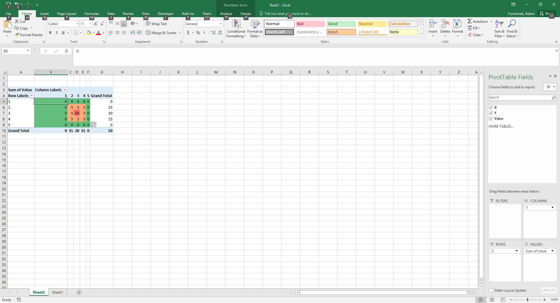
Pivot tables
Select your whole data (three columns). Choose Insert -> Pivot Table and hit OK. Next, drag X to rows, Y to columns, Value to Values. You should get ordinary pivot table. Now, select values inside it and apply color formatting again. See below: